First screen of a mobile landing page: what to keep, what to remove
If the first screen doesn't convert on mobile — the rest of the landing page doesn't matter. We break down what you must keep and what kills your conversion rate on mobile traffic from Facebook and TikTok.
Over 85% of traffic from Facebook and TikTok comes from phones. Yet most landing pages are still built for desktop and just "squeezed" for mobile. The result — leads at $4.3–$5.3 instead of $2.2–$2.7 and approval rates that no call center team can fix. This article gives you a concrete checklist: what must be on the first screen of a responsive landing page, and what to ruthlessly remove before launch.
Why the first screen decides everything
A user from TikTok or Facebook Reels arrives "hot" — they just saw a video of the product and tapped. They have 3–4 seconds before they close the tab. In that time, they don't read — they scan. If the first screen doesn't answer "what is this, how much does it cost, and what do I do next" — they're gone. Conversion rate drops, lead cost rises.
For a mobile-traffic single-product landing page, this means one thing: the first screen must fit within one scroll tap height and deliver answers effortlessly.
What you must keep
1. Headline — one sentence, one pain point or one result.
Not "Innovative back massager," but "Relieves back pain in 15 minutes." Max 8–10 words. On a smartphone, font size must be 22px or larger — smaller won't be read on the go.
2. Product photo in close-up, no unnecessary background.
One full-screen photo or a photo at 60% width next to the headline. The user must recognize the product from the video they just saw. A collage of 4 images on the first screen — unnecessary.
3. Price or discount — immediately.
If the product is $21 instead of $36 — it must be visible without scrolling. Price without discount lowers conversion: people don't understand if it's a good deal.
4. One CTA button — large, contrasting, clear.
"Order for $21," "Get with discount," "I want to try" — be specific. The button must be at least 48px tall so it's easy to tap with a thumb. Two buttons on the first screen — that's already a choice, and choice slows things down.
5. One social proof — micro.
Stars + order count or one short quote: "Already 1 840 orders this month" or "⭐⭐⭐⭐⭐ 4.8 — 620 reviews." Not a paragraph — one line.
What to remove without hesitation
Navigation menu. On a mobile single-product landing page, the menu is an exit route. A user taps "About us" and never comes back. Remove it.
Slider with 5+ photos. Sliders slow down mobile, not everyone swipes, the first photo is seen by all — that's it. One strong photo beats a carousel.
Large text block "About the product." Three paragraphs in small font before the button — 3% of the audience reads it. The rest close the page. Details go below, after the first screen.
Multiple phone numbers and links. Each link is an exit from the funnel. If there's a lead form — remove the direct number from the first screen.
Animations and auto-playing video. They drain traffic, slow loading, and annoy users. Mobile landing page load speed for single products is critical: each extra second costs 7–10% conversion by market estimates.
Large logo. Brand rarely matters in single-product e-commerce. A 40×40px logo in the corner — maximum, if needed at all.
Real test: the thumb test
Open your landing page on a phone in incognito mode. Show it to someone who doesn't know what the product is. Ask: what is this, how much does it cost, what do I do? If they answer in 5 seconds without scrolling — the first screen works.
Practical benchmark for testing: on Facebook ads for products $14–$36 (knee braces, massagers, home goods), a first screen with a pain-point headline + large photo + discounted price + one button delivers 4–7% CR on cold traffic. If it's below 3% — there's a problem, most likely right here.
A/B-testing the first screen isn't a luxury. Even changing button text from "Order" to "Order for $21" gives +0,5–1,5% conversion on volumes from 500 visits. On a $120/day budget, that's noticeable.
How to do it in LandEmpire
- Open the "Landing pages" → "Product link landing page" section — paste a link from Rozetka or Prom, click "Build landing page". Photo, price, and name pull in automatically, and the first screen is already responsive for smartphones.
- To edit the headline or button — click the block in the editor, enter your text. Navigation menu in single-product templates is disabled by default.
- Via the "Add block" panel (keyboard shortcut «/») add a "Limited stock" or "Order feed" block — social proof in one line right under the CTA.
- To preview how the first screen looks on a phone — click the smartphone icon in the top editor panel before publishing.
- Connect Facebook Pixel: landing page card → «⋯» → "Landing page settings" → the "Ads" → field «Facebook Pixel ID». This way, events from the first screen go to your ad account right away.
- On the Pro plan, launch A/B test: product card → «⋯» → "A/B test" → "Create variant" — test two versions of your first screen and declare a winner based on stats.
Summary
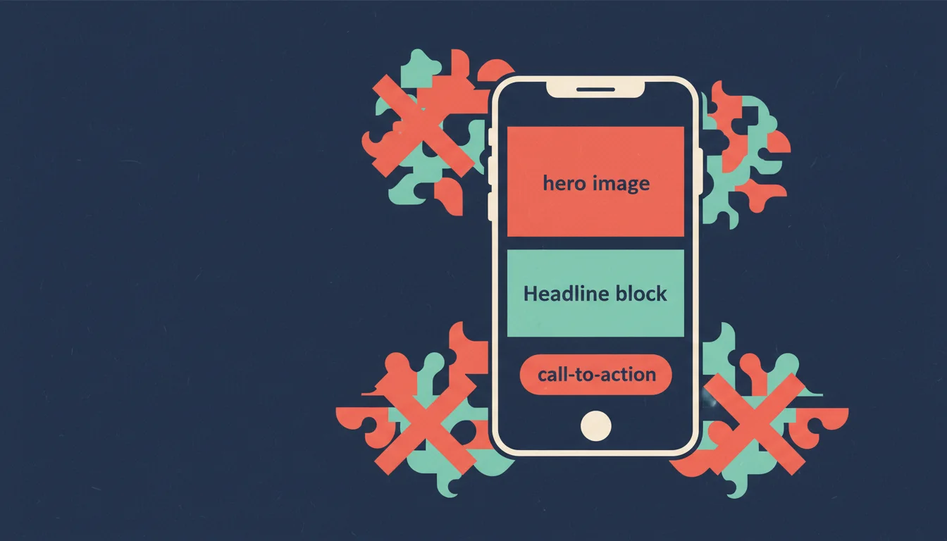
- The first screen of a mobile landing page should have a headline with pain or outcome, one large image, discounted price, one CTA button, and social proof.
- Remove: navigation menus, sliders, long text blocks, multiple links, autoplay video, large logos.
- Run the thumb test: 5 seconds — three answers without scrolling.
- An A/B test of your first screen on 500+ visits shows meaningful CR lift even from changing button text.
- Build a responsive landing page and launch the test right away — create a landing page for free.
How it's done in LandEmpire
Build a landing page like this yourself — in one evening
LandEmpire has ready-made templates for single-product e-commerce, leads go straight to Telegram, your domain connects in minutes, and UTM analytics show exactly where each lead came from. The starter plan is free — no card required to get started.
Create a landing page for free